实地笔记 01 · 王瑞妮
Jun 5, 2026 · Updated in 6 hours
We used to blog about how to code. Now it's time to blog the decision. I've been thinking about writing field notes for a long time. The term used to be observing other people, but this is about observing my own thoughts.
I'll share some revamping across projects I worked on here.
This is a crucial part of LobeHub. It carries all context except the message. But with many things off.
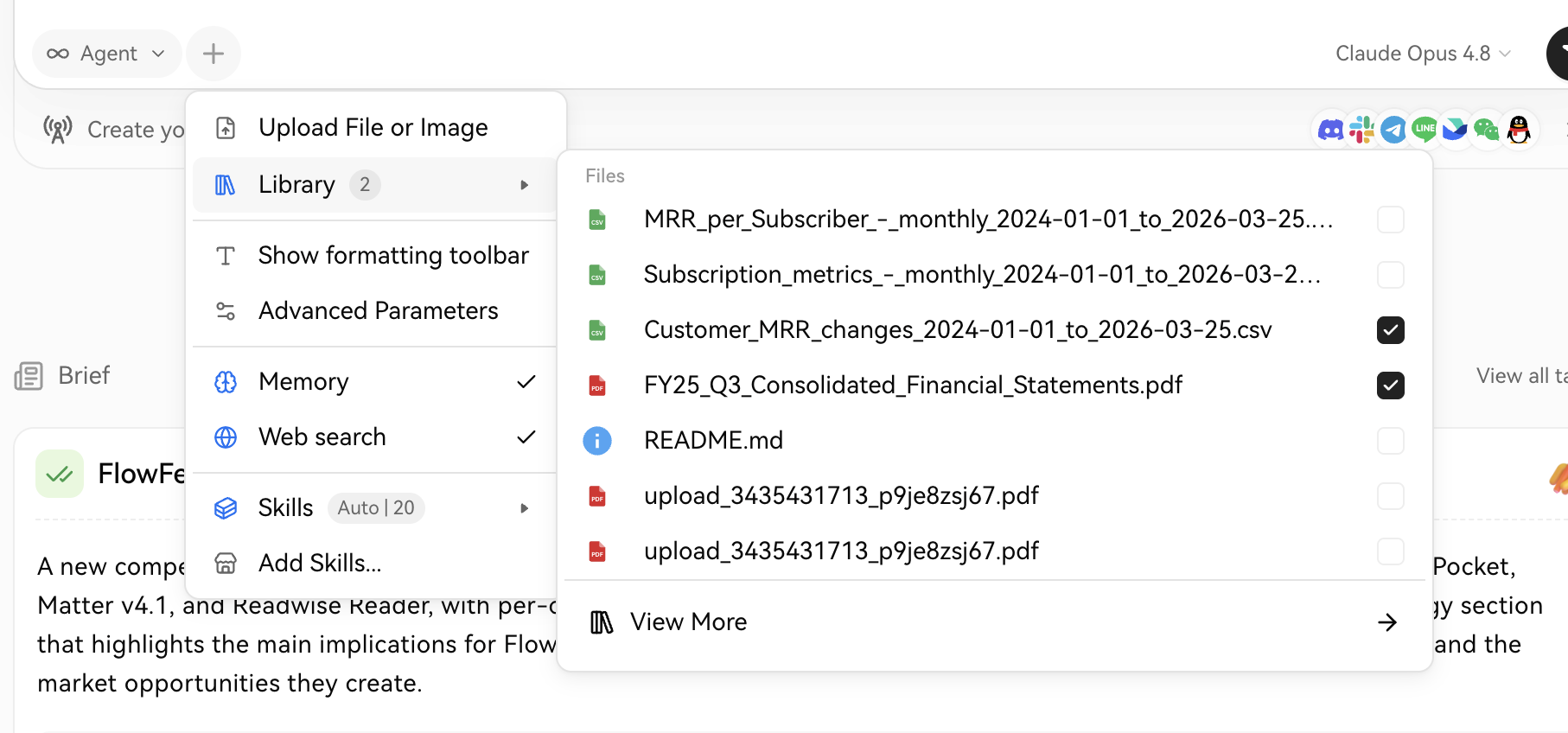
Old context menu
- Ambiguous function: what does
Show Formatting Toolbardo? Will this open a new dialog? (It's actually a checkbox)
- Icon color swap based on state: Information overload.
- Mixed trailing arrow icons
→ / ▶︎
- Progressive exposure: why is
Add Skillsparallel withSkills, whileView More Filesis not parallel withUpload File or Image.
- Wording: "Upload File or Image" should be "Attachment".
- File name truncation: only truncating the trailing part. Should truncate the middle part.
After all these problem fixed:
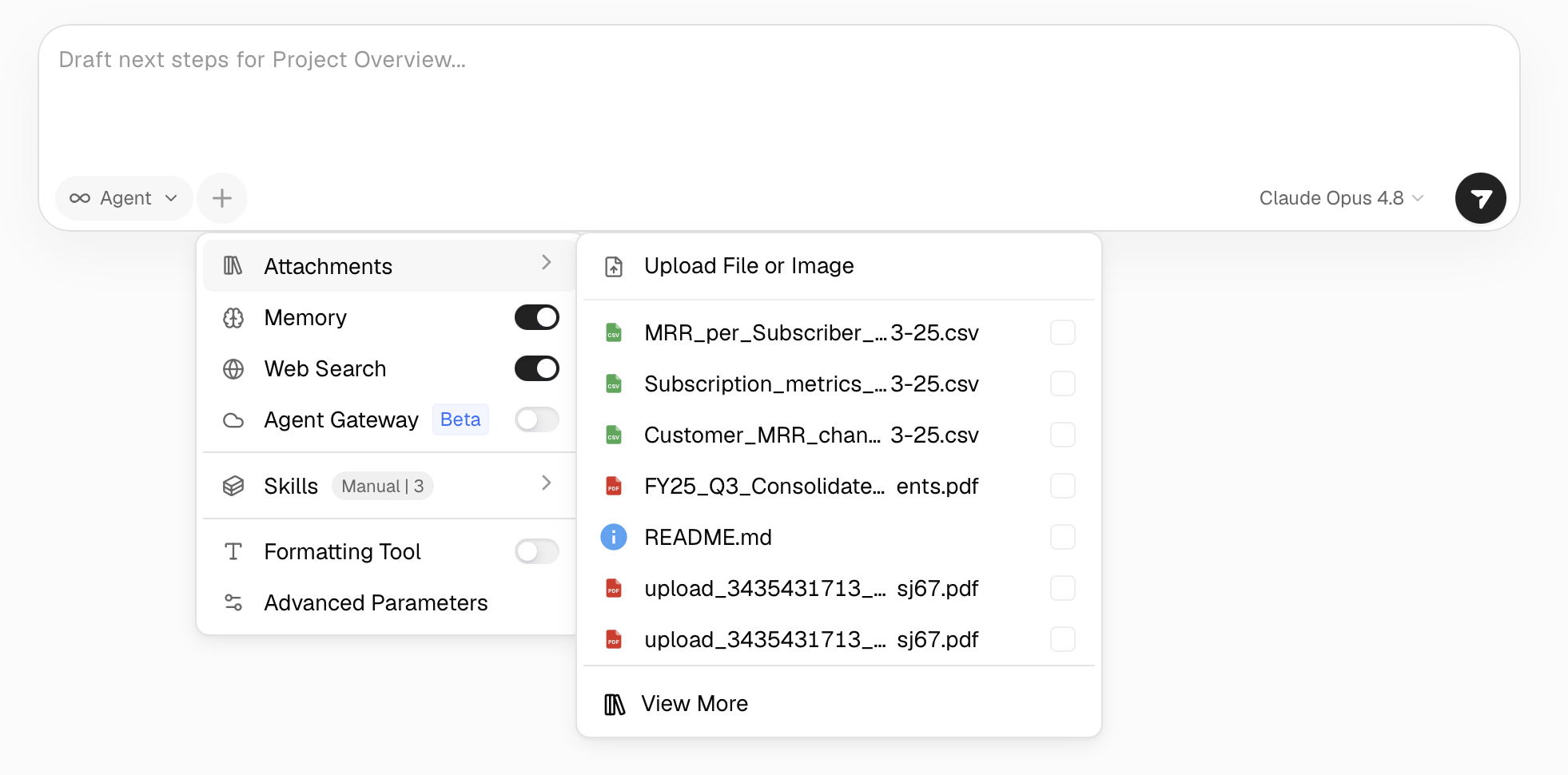
Revamped context menu
The rules are:
- Consistant & clean wording
- Information structure & progressive explosure
- Consistency over tuning
Janky Transition
This is the major transition in . People click on a detail card to see more about the detail.
0:00 / 0:08
Before
Originally I put
layout on the card and it animates its own size and position. The contents drift along a slightly different path, arriving a beat early or late. Nothing is technically broken, yet the eye reads it as "off" instantly.The cause is that Framer Motion animates every
layout element on its own independent spring. Leave the transition off and it falls back to the default; hand-tune each one, and they each run slightly different physics. The frame travels on one curve while its children travel on five others.The fix is to make everything move on the same spring. So I pulled the spring out into a single constant and handed that exact
transition to every animated element in the expand:0:00 / 0:09
The article frame, the media, the title, the summary, the tag row, and each tag chip now share one physics simulation, so they accelerate, travel, and settle together, riding the frame as a single object. The takeaway is small but general: for coordinated layout animations, consistency beats tuning.
Privacy Warning Dialog
The major problem here is wording.
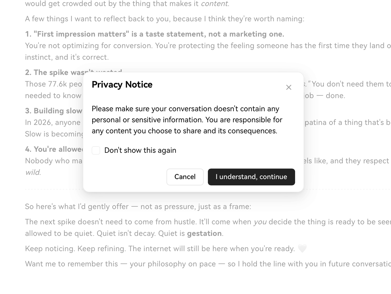
Old version
The first time I saw the dialog, I almost immediately skipped it — no hook, no real reminder, just a warning that no one likes to read.
Revamped version
Here we are showing a Twitter browsing history list.
0:00 / 0:08
The original search
It used to be a one-column layout. I realized that one column is for focusing on each post, but people come here to quickly find a certain post, so I switched to a masonry layout.
The search bar was originally a show-off widget, back in 2022 when I was building it. So I reverted it to a common, familiar pattern.
The original icon is semantic but ugly: restore your Twitter home page. The revamped one kept the Twitter bird home element but added some offset.
Revamped version
More Before / After
Here are more comparisons. Try adjusting the handle to see what's changed.
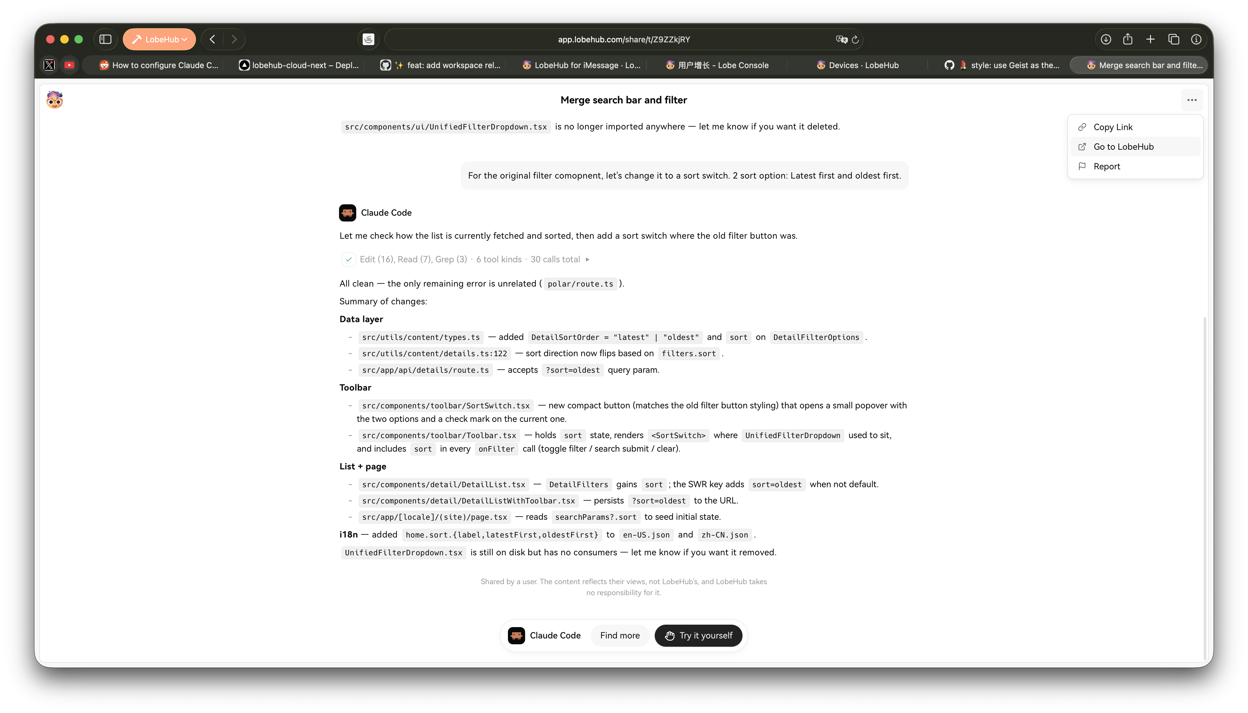
Share Screen of LobeHub
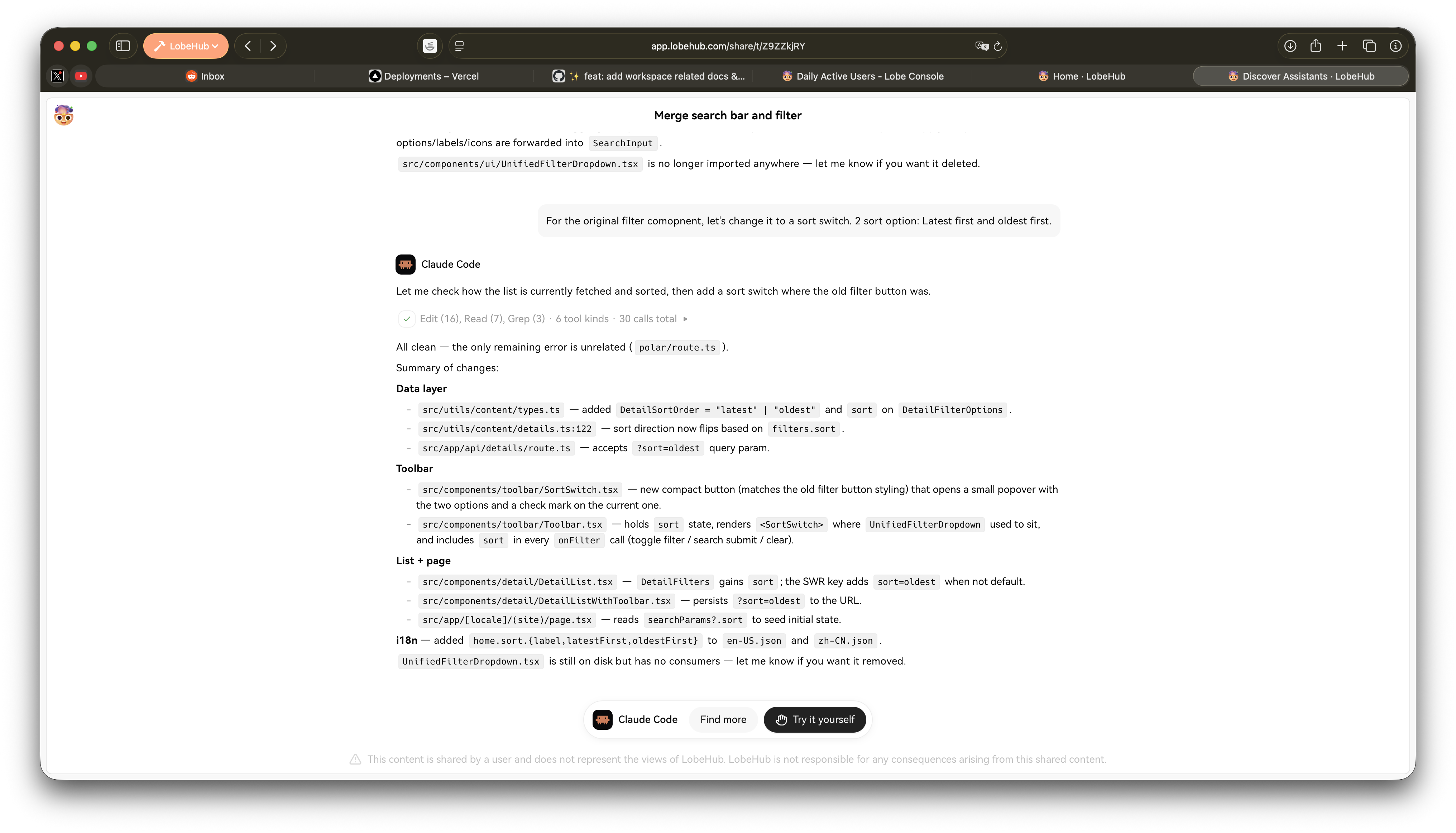
Share Screen of LobeHub
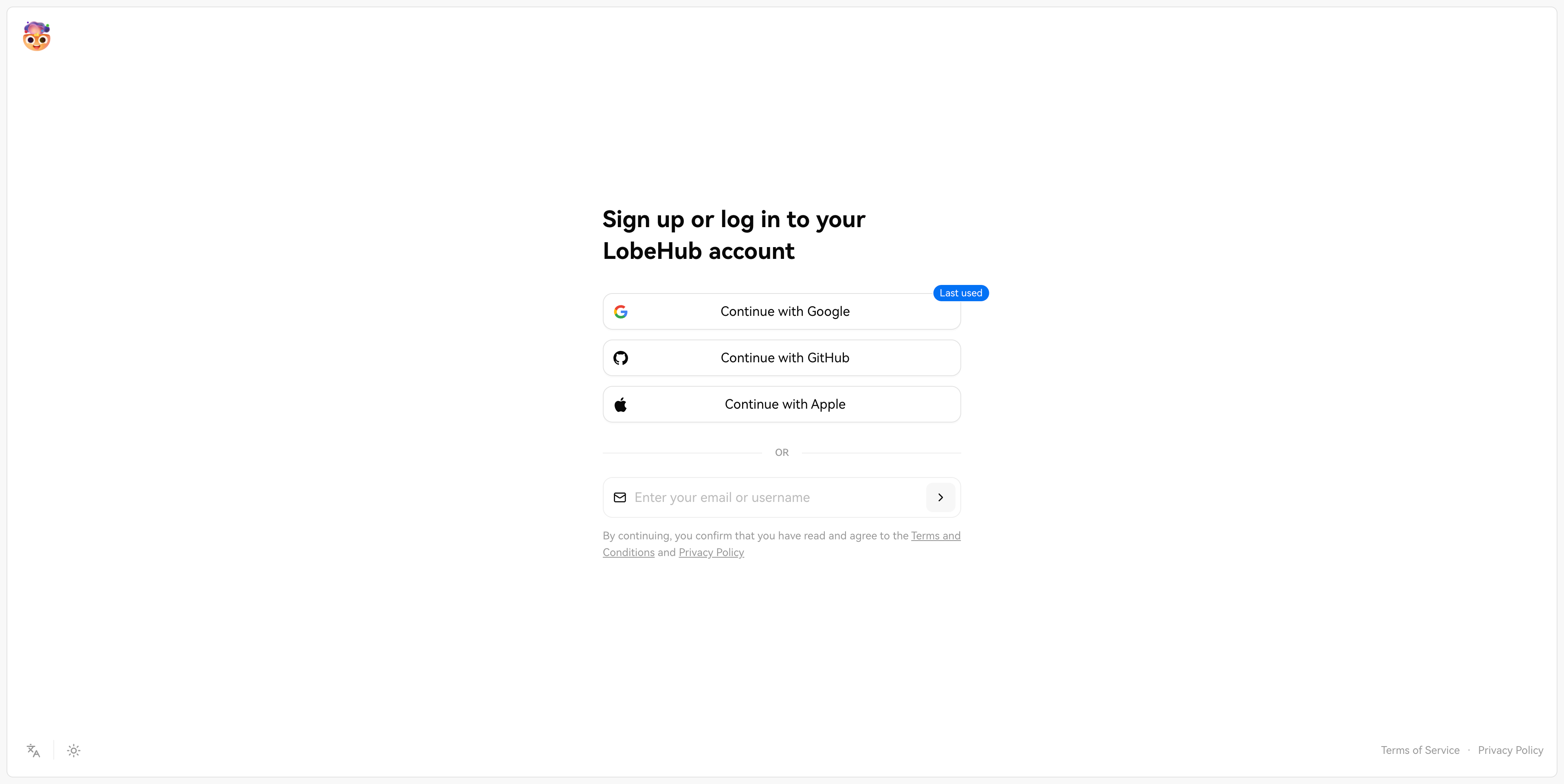
Login Screen of LobeHub
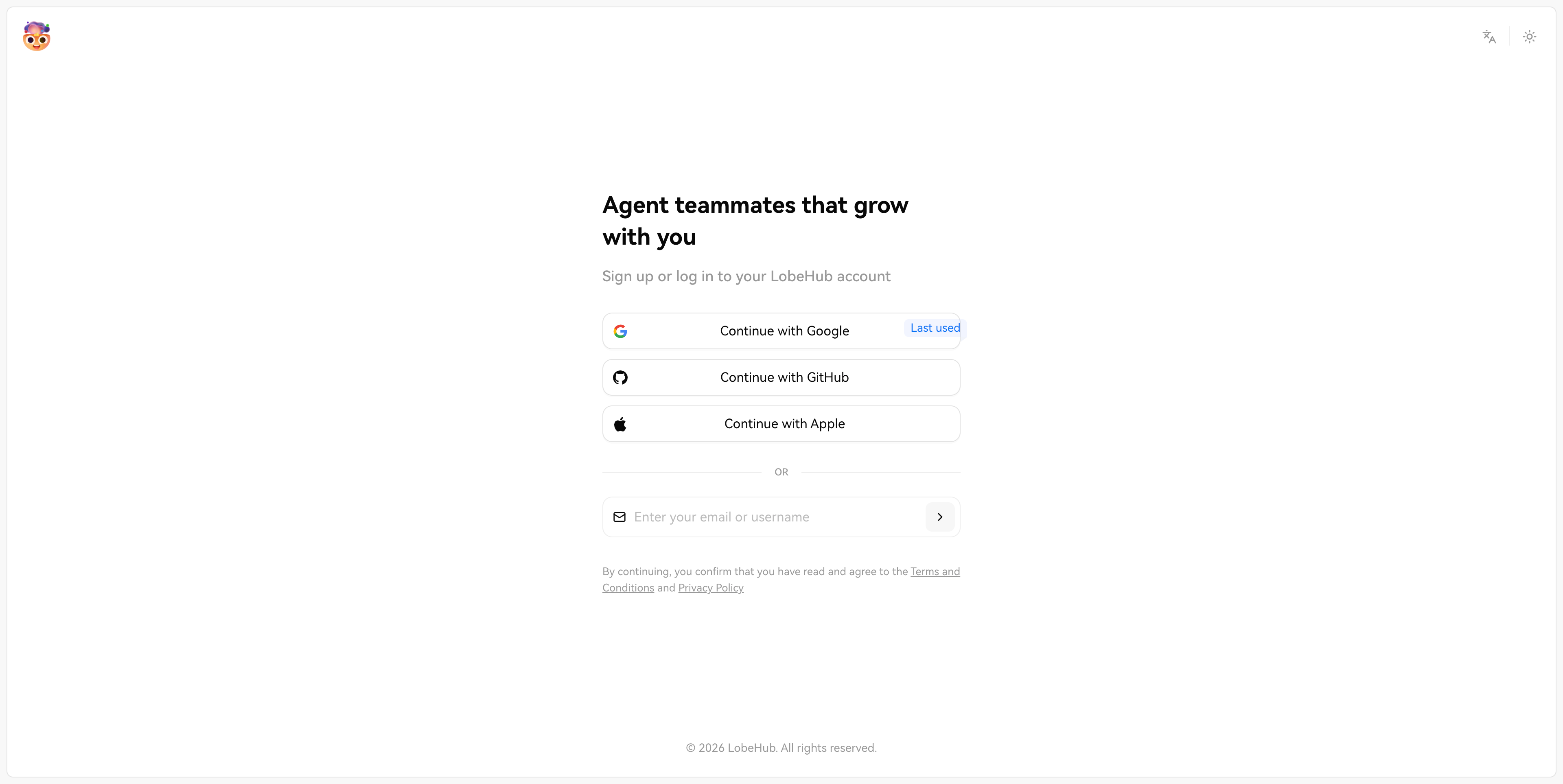
Login Screen of LobeHub
If there's more revamping worth sharing, I'll write a second one.
No content is written by AI in this essay.